// MY PLAYSTATION
My PlayStation
The largest PlayStation news channel in the Americas, redesigned from discovery to pixel.
- Service Design
- UI | UX Design
- Development & Tech
Challenge
My PlayStation was already a reference for the PlayStation community, but the platform needed to keep up with its audience: more content, more formats, higher expectations of fluidity. The challenge was to redesign the site and app without losing the identity the community had built, improving end-user experience and interaction while keeping the channel’s voice.
Solution
We worked in layers: service research with users and stakeholders, a prioritized innovation roadmap, and only then the UI redesign. The result is a coherent gaming experience across web and mobile, with clearer navigation, strong editorial hierarchy, and interface details that celebrate the PlayStation universe.
// HOW WE DID IT
Before opening Figma, we opened the conversation.
We learned how the newsroom publishes, how readers search, and how the brand needs to advertise. Only then did we design the system that holds it all together.
// DELIVERABLES
Discovery (Service Design)
Gathering and structuring insights from the platform’s clients and users: real pains, routines, and opportunities, not slide-deck hypotheses.
Innovation Roadmap
Mapping and prioritizing a backlog of possible innovations and features for the platform and project, focused on impact without losing direction.
UI Design
Redesigning the existing platform from earlier findings: from the sticky home to tag typography, from dark mode to the search button detail.
“Service research took us deep into the gaming universe and into conversation with platform users. The opportunities we found fit the market and the community My PlayStation had already built.”
Service Design Team
The app as an extension of the newsroom
On mobile, every inch matters. Shrinking the site wasn’t enough: we redesigned reading, search, and category rhythms for the thumb, without losing My PlayStation’s voice.
- Categories and feeds built for fast scanning without losing editorial hierarchy.
- Search and results that bring news, reviews, and deals into one gesture.
- Authors and tags as continuity points: readers return by habit, not only via home.
// APP


A portal that scales content
The desktop home carries a daily channel’s weight: features, ads, lists, and navigation. We made the long scroll intentional: every block with a job, never a generic endless feed.
- Clear hierarchy between editorial hero, commercial modules, and listings.
- Sticky and long sections tuned to My PlayStation’s real publishing rhythm.
- Navigation and search reachable without competing with the main story.

The article page where the story lives
The article template is the product. Typography, media, and related modules exist for deep reading and for the next click that keeps readers inside My PlayStation.
- Comfortable reading across long blocks, without visual noise.
- Media and embeds treated as part of the narrative, not attachments.
- Related modules and CTAs that extend the session without breaking flow.

The details that build the brand
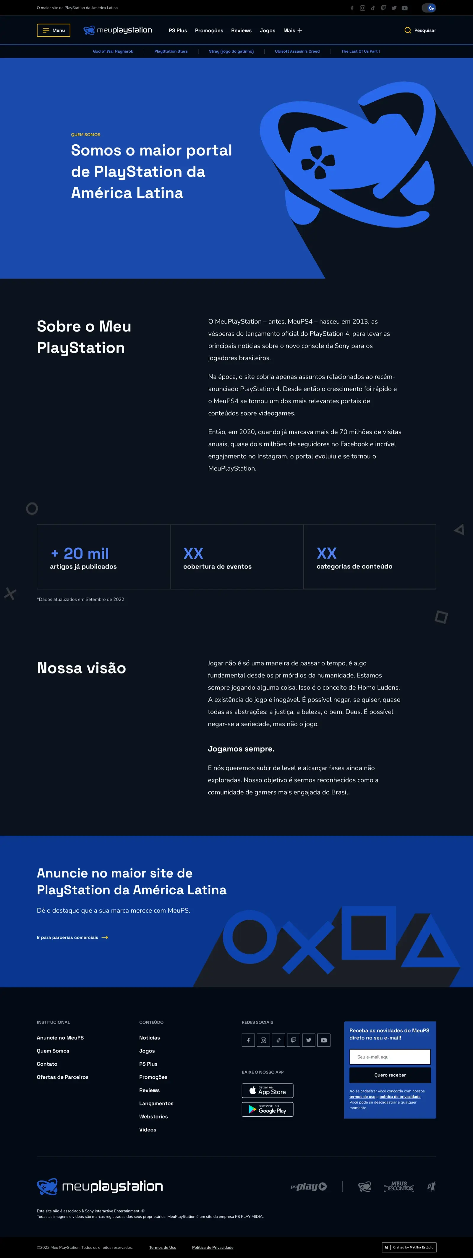
Light and dark, partnerships, about us, tag and following states: identity becomes a system in the corners. Below, fragments of that design system in use.
- Light and dark modes coherent with the channel’s gaming aesthetic.
- Institutional and commercial screens sharing the same visual grammar.
- Micro-states (follow, tag, empty) treated as part of the experience.
// DETAILS





// TEAM
- Barbara Borges | Lead Ops
- Rodrigo Vidinich | Service Designer
- Bianca Falcão | Service Designer
- Rodrigo Ramos | UX/UI Designer
- Rodrigo Liva | UX/UI Designer
- Barbara Lourenço | UX/UI Designer
- Ilana Heymowski | UX/UI Designer