
// MATILHA
A Matilha case for Sestini

AVisual Identity Guide
Matilha designed Sestini’s visual identity guide: system, palette, type and applications for Brazil’s reference brand in luggage, backpacks, bags and accessories.
- Branding
Challenge
Sestini came to the studio with a new logo. The brief was something else: turn it into a system, with rules, palette, type and applications so institutional communication could speak with one voice, from the suitcase to the airport.
Solution
We turned the mark into a method. Lockups, minimum sizes, an institutional palette and a cut of real-world applications: product, merchandising, social and media.
// MATILHA
The new logo had to become a system.
At Matilha we started from the redrawn mark and organized what holds the communication together: brand versions, color, type and how they show up on product and in the street. Red was already Sestini. The work was giving it a setting that matches.
// DELIVERABLES
Brand system
Horizontal and vertical lockups, with and without tagline, for institutional and product contexts.
Institutional palette
Vermelho, Sand, Mirage and White as the core. Blue, Orange and Topaz as an extension, always at a smaller scale.
Typography
Unbounded for titles: geometric, wide, aligned with the symbol. Supporting text in a humanist sans for long reading.
Applications
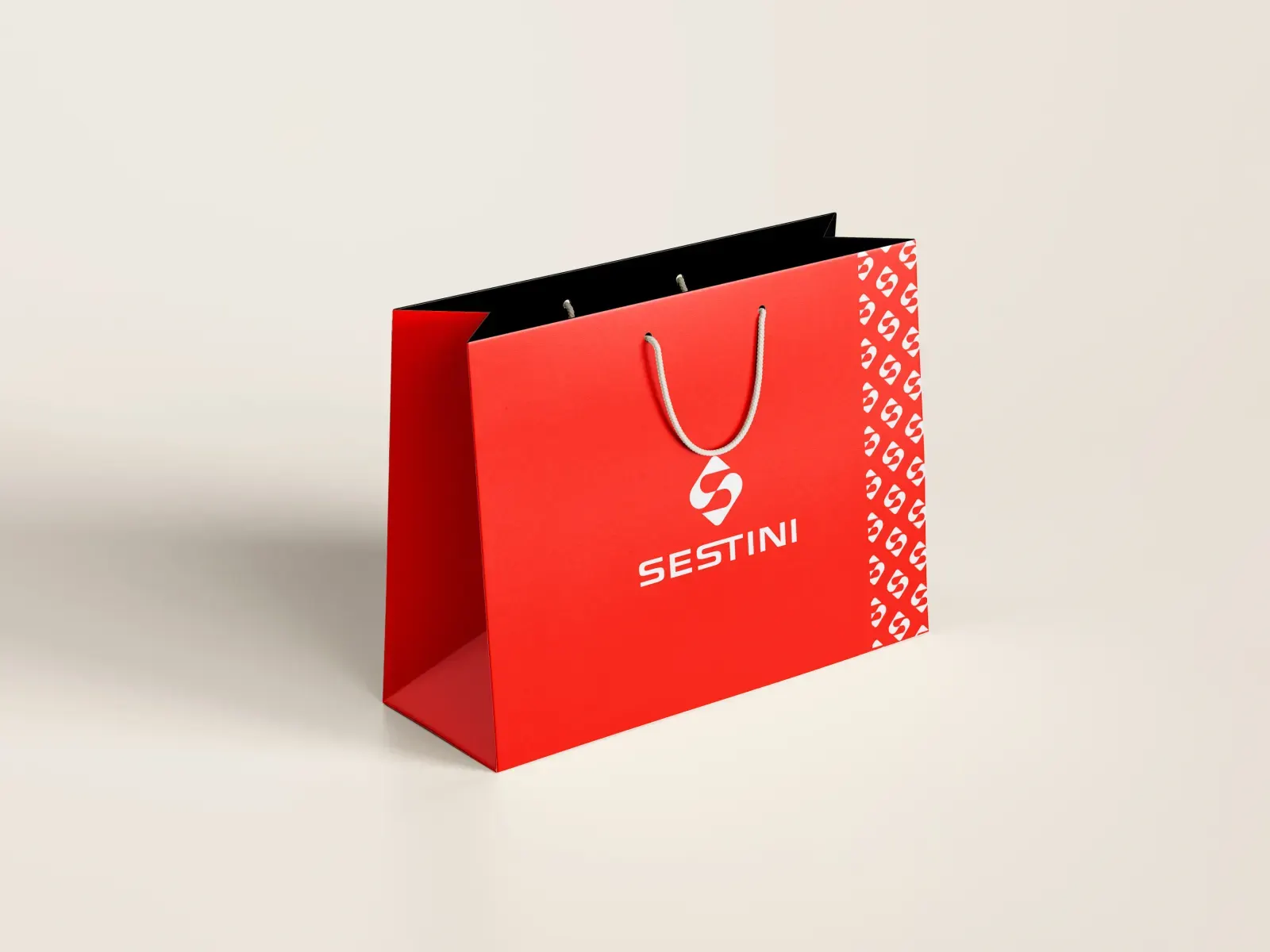
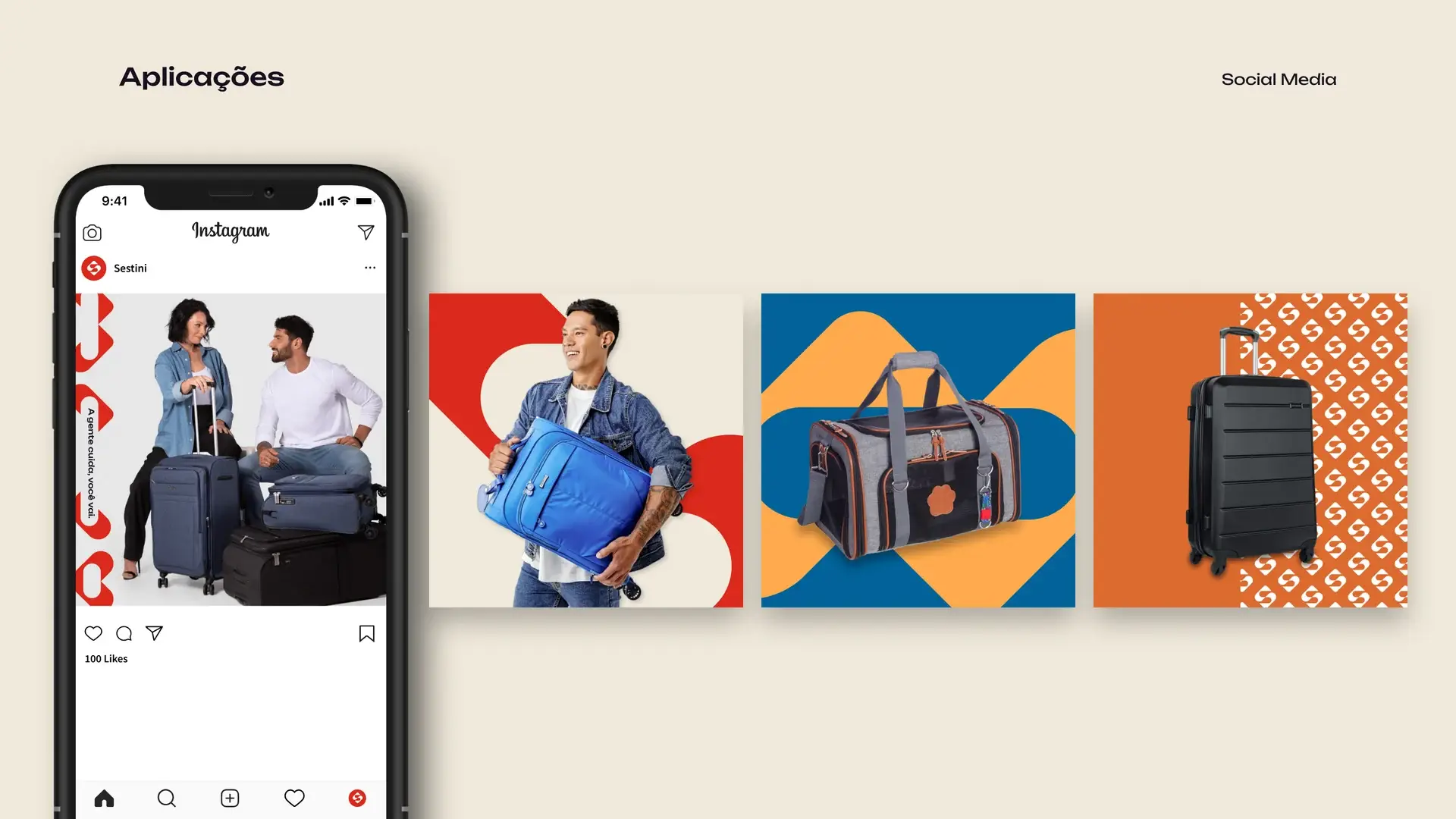
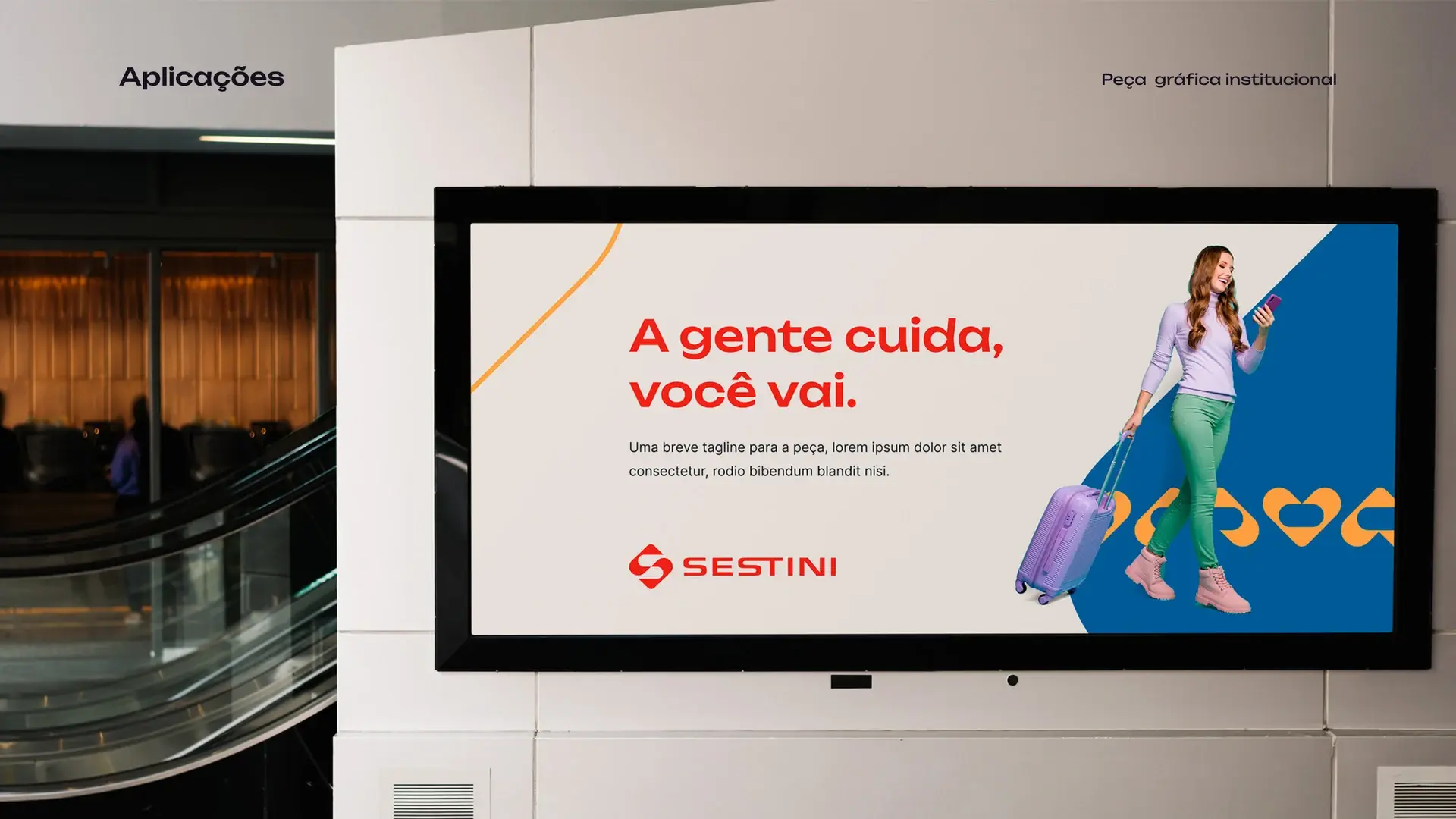
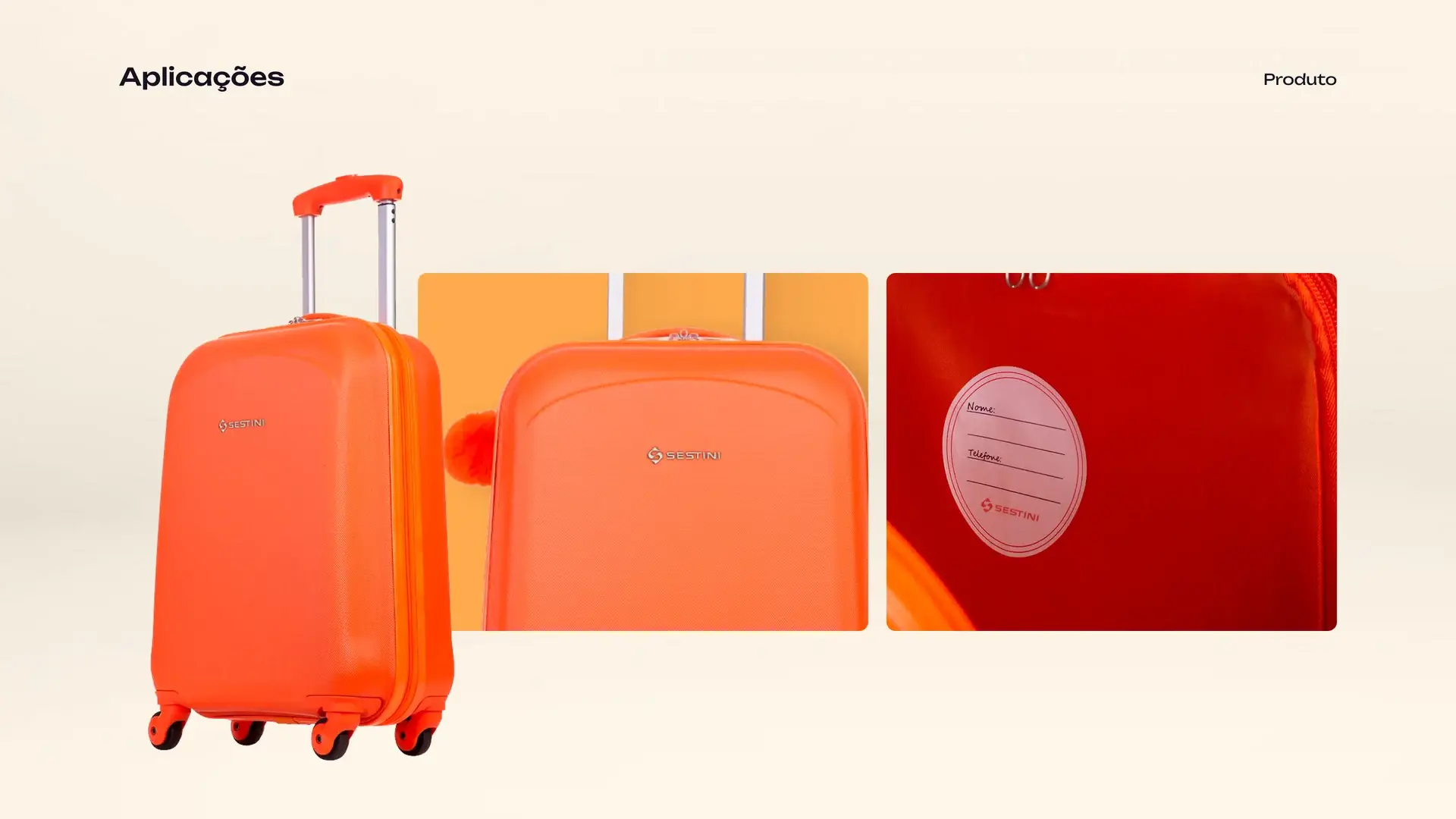
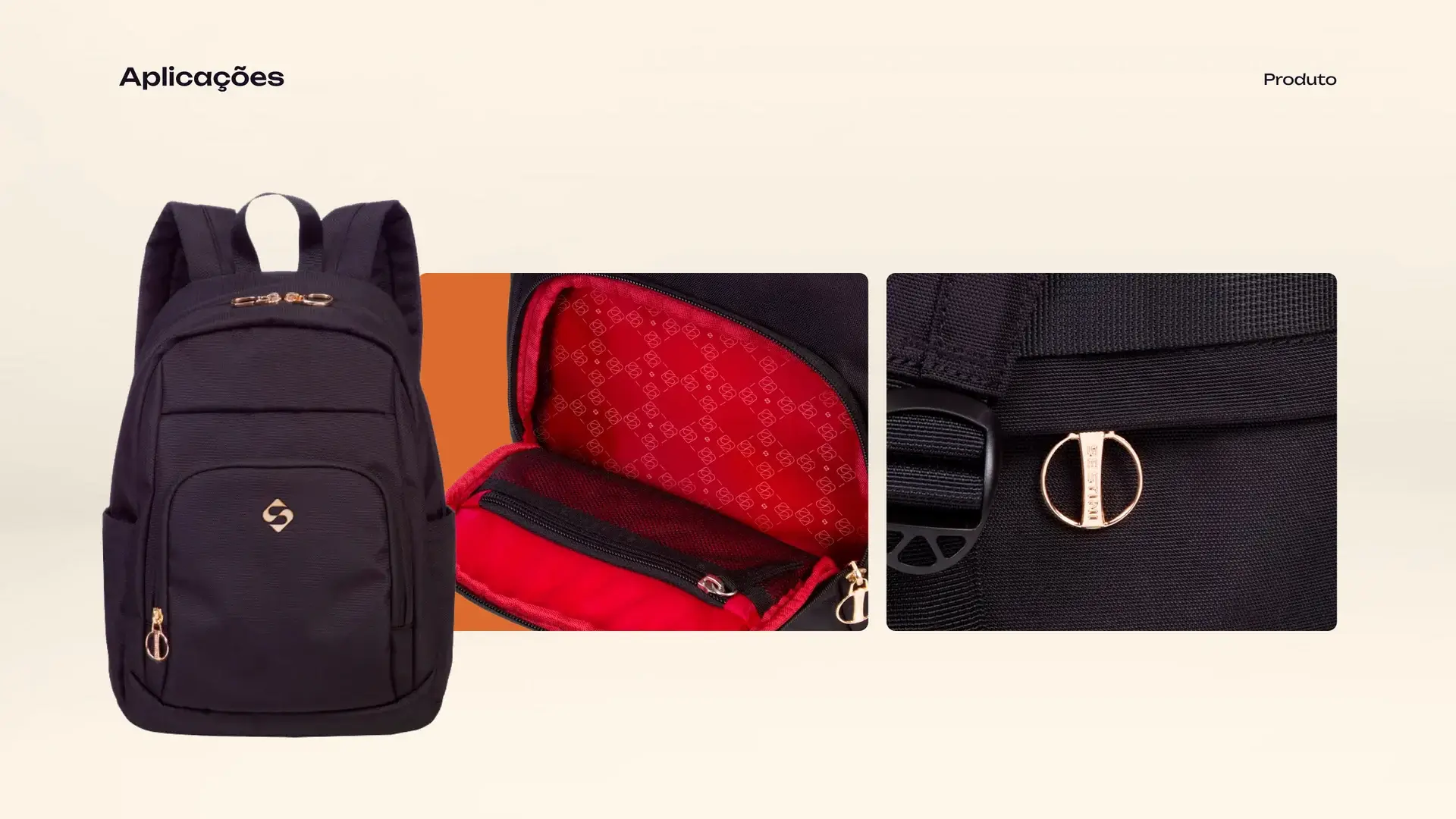
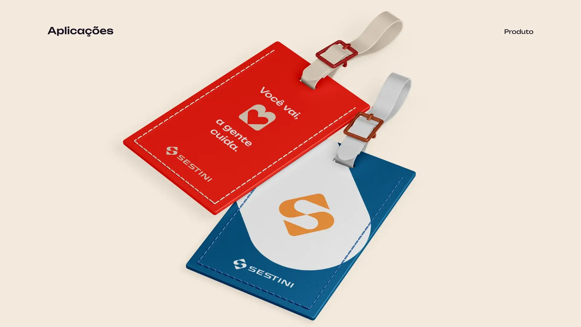
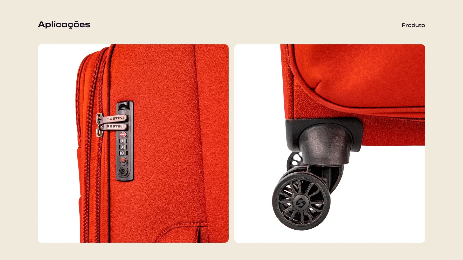
From feed to billboard, luggage tag to suitcase: the brandbook proves the mark in use, not only on the board.
// BRAND
The mark in every direction
Horizontal for institutional signature, vertical for tight spaces, tagline when the line needs to travel with it. The diamond symbol, an S in two arcs, is the core that repeats from padlock to façade.


// PALETTE
Primary colors
The palette puts Vermelho first, a long-standing Sestini color. Sand brings lightness to large areas. Mirage and White deliver contrast and a more contemporary tone. Secondaries widen the range, always next to the core.
// INSPIRATION
The palette comes from travel
The secondary colors came from the tagline and from how you go: sky, land or sea. Topaz, Orange and Blue were pulled from the airplane-window photograph, then tuned to fit the Sestini palette.
- Topaz
- Laranja
- Azul

// TYPE
Unbounded for titles
The brandbook’s display family is geometric and assertive, built for titles and high-impact pieces. On this case it is the brand’s voice. Body copy follows the studio’s reading.
- Regular
- Medium
- Bold
A gente cuida, você vai.
// GRAPHICS
The S becomes a graphic
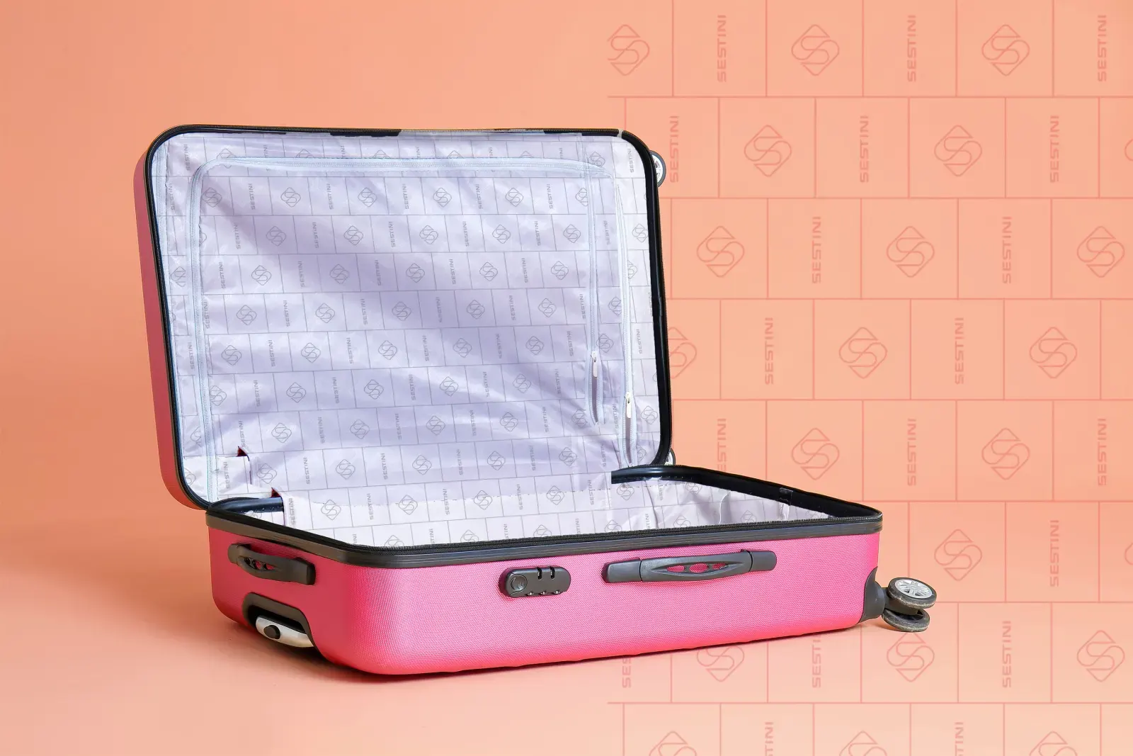
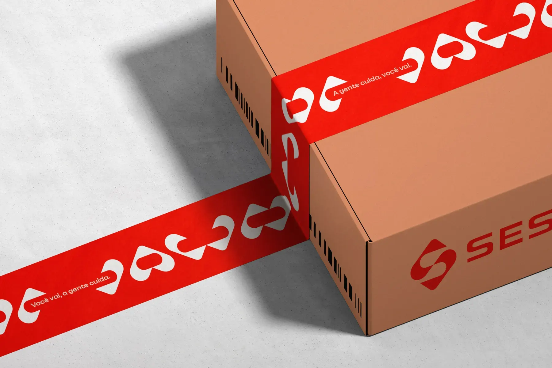
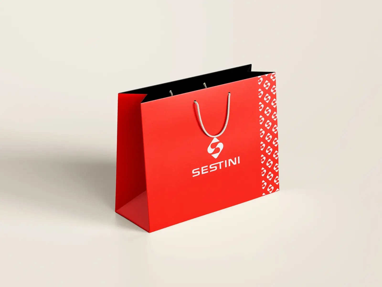
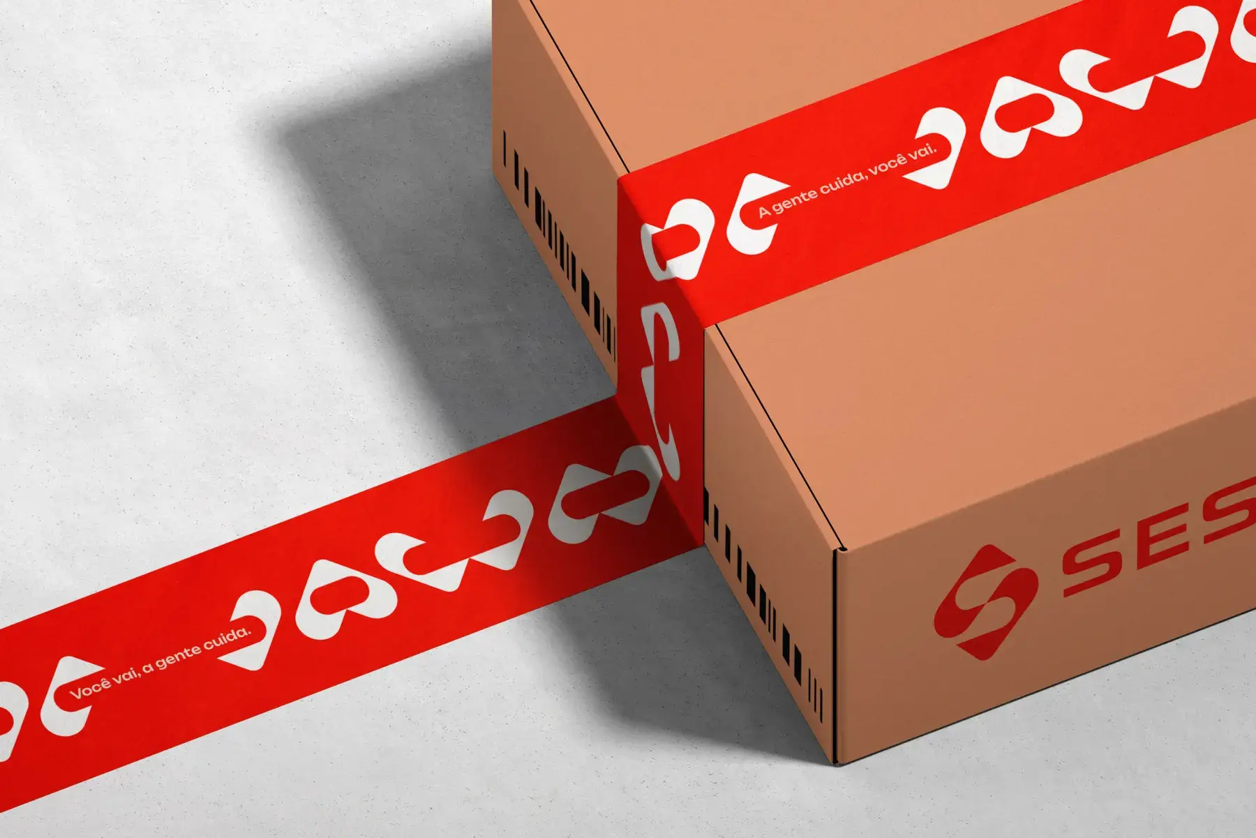
The two arcs of the symbol become a pattern. They fill tote, suitcase, tape and ground, readable from a distance, never noise. Vermelho, Blue, Orange and Topaz carry the same drawing.

// ELEMENTS
Supporting shapes
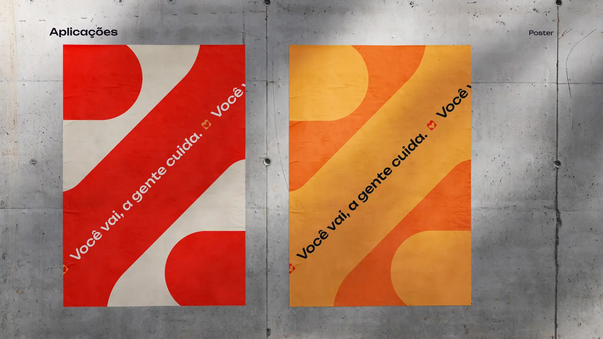
Shapes derived from the symbol, for more fluid compositions. They support the identity in the real world, from the horizontal band to the tape that seals the box.


// APPLICATIONS
From the board into the world
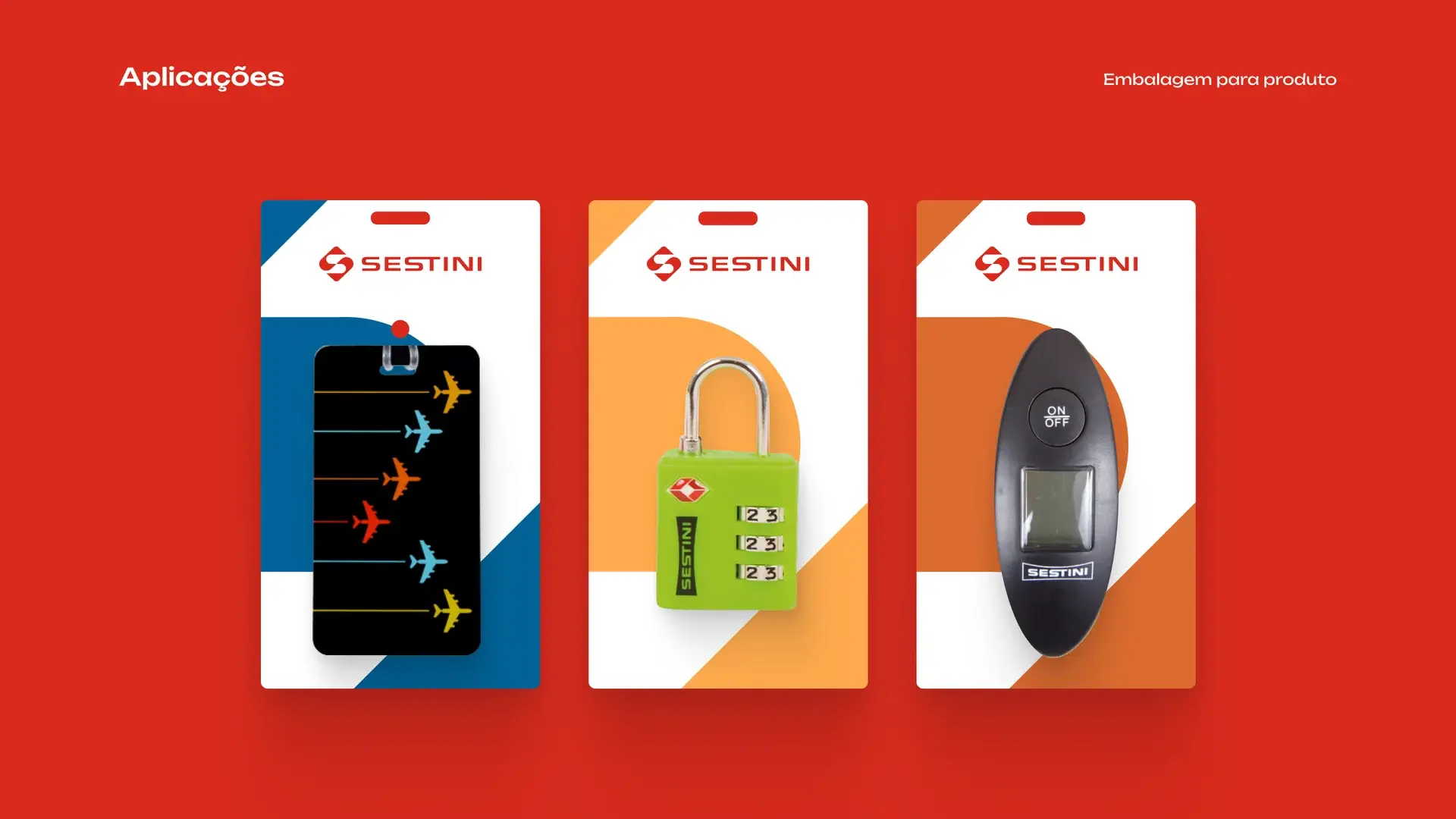
Instagram, poster, airport, accessories and product. The brandbook does not end in a PDF: it has to survive checkout, the baggage belt and the timeline.
// MATILHA
A gente cuida, você vai.
Branding case · Matilha Estúdio for Sestini